Thursday, December 11, 2014

Clay Mask Project


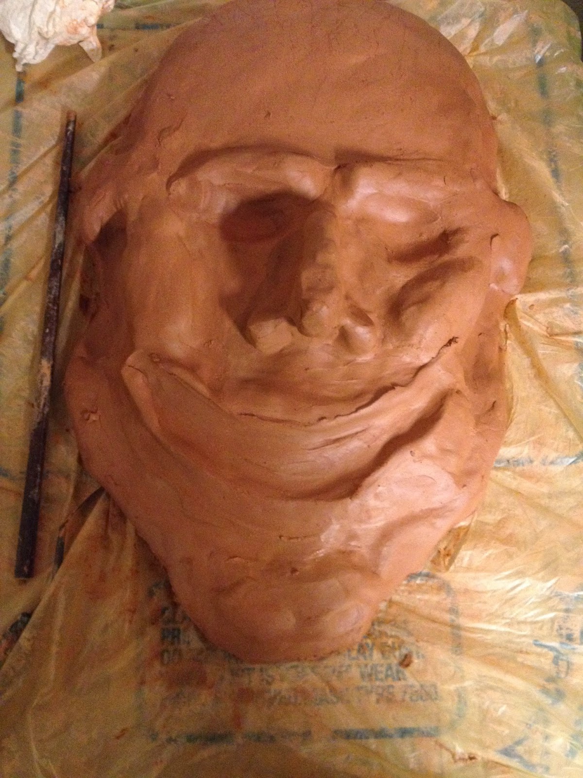
The picture above shows how my mask is progressing. When I had first started with my original design, while still retaining a bit of an aged appearance, it was meant to look more uniform and smooth.  I had intended to give the mask a very symmetrical, straight nose. But as I had begun sculpting the nose onto the slap, I found that a curved and somewhat crooked bridge added character to the mask. Eventually, I had gone for a hooked nose with uneven nostrils. This eventually led to the protruding brows and curved cheekbones. The hollowed sides of the face had been a last minute add on, seeing as I liked how it emphasized the roundness of the cheeks and the sharpness of the temple. Other things that were not shown in the photo was how I had made tentacle-like protrusions spreading out from the forehead and wrapping around the head. At first, I was supposed to scrap that piece from my original design. But after seeing how it could be advantageous to the various media I could attach onto it, I had kept it. Tiny holes were made for the future additions of plastic leaves or other media.
After the mask had been fired and cooled, painting and adding on the other media was the easy part. With the use of oil paint, I had painted the mask a deep aquamarine color, making sure to add on various swirls of color as well. The tiny holes that I had made to the forehead and eye sockets were then filled with marbles. Plastic leaves as well as various shiny beads were also glued onto the head.

Overall, I found the project to be quite fun and a new experience. At first, I was having a bit of a problem molding the clay together and working with water, seeing as clumps of it would stick onto and in between my fingers. But eventually I had come to adapt a certain rhythm. Working with subduction had also been a bit difficult for me, seeing as I favor my left so much and would often make a messy cut to the right. I found that creating a symmetry with the mask sculpture was much more challenging than with two dimensional art as well. This project has given me a better appreciation of the sculpting process and structure of the face.   

The Two Amigos


The drawing above shows to people posing next to each other. The figure closest to the foreground appears to be blowing a kiss, while the other one behind her looks on. The figures in the composition are not drawn to actual scale of their models. Done on a 24 x 18 sheet of paper, various graphite pencils were used in this portrait. Thus, the colors of the drawing are limited to a grayscale. Contour Lines essentially make up this entire piece. The lines all vary in thickness and value, with the outlines of the figures being the boldest, and the details in the clothing and face being the lightest. Excluding the shading done to the hair and faces, the mustache of the closer figure is the boldest and darkest contour line in the composition.
The composition itself is somewhat asymmetrical. The figures are mostly positioned in the middle of the paper. The initial sketch of the drawing was done on a grid. Contour lines were then added on top of the searching lines. Seeing as the figures must be distinguishable from each other and the background, darker lines were used for their outlines. The darker lines were achieved with the use of a softer pencil with pressure applied. Lighter lines were used to draw out the folds and shadows of the clothing and face in order to add a bit of depth into the drawing. This was done with the use of a harder pencil with little pressure applied.
While the project focuses more on the importance of contour lines and the possibilities it can achieve, the subject of the drawing does hold a sentimental value to me. The drawing itself came from an old photo I had taken of my friends two years ago for a project. The both of them were meant to dress up as two shady figures, thus the reason for the taped on mustache and huge bush brows and unibrow. The use of different values and thickness of lines does add to a bit of realism to the drawing.
Overall, I thought that the contour lines came out nicely for this piece. While the pattern shading somewhat hides the soft and hard contour lines done on the face and hair, it was done fairly well in my opinion. If it weren’t for the fact that I need this drawing for another assignment later on, I would have kept it as it is, if not for the simplicity of the contour line drawing, than maybe because using the patterns does distort the picture a bit.


Mannequin Still Life


The drawing above shows a headless mannequin with a cloth draped on its shoulder, placed behind what appears to be a pot. A shadow is cast by the mannequin. The objects in the picture are not drawn to the actual size of what they were modeled after. Drawn on an 18 x 24 paper, graphite pencils were used for this piece, thus the colors are limited to a grayscale. Contour lines were used in the drawing, especially in forming the mannequin and cloth’s figure. Close up, it could be seen that the drawing is made up essentially of contour lines of different values, thickness, and length. Several contour lines run across the background as well as wrapping around the figures in the composition.
Drawn from still life, no grids were used for the initial contour lines. The composition as a whole is asymmetrical as well as going beyond the paper. The most prominent feature of this drawing is its use of lines. Cross contours to create shadows and form, giving the illusion of depth in the composition. Light areas are composed of lighter lines that crisscross over each other and are applied with little pressure or with the use of a harder pencil. In the darker regions, the vice versa is applied. Even for the more solid, flat areas such as the shadow and the background, a tighter and even-handed application of crosshatching is employed. The drastic shifts in various parts of the drawing creates the illusion of light, especially from how a shadow is cast and the highlights formed on the objects if the composition. The use of shading to create shades and value gives the piece a more natural and realistic feel.
The drawing itself is a still life, so there isn’t really much that could be said about the composition itself on a deeper context. This project does emphasize the power of lines and cross contours in creating a two dimensional figure. With the shadow lines running on the background as well as wrapping around in odd shapes on the foreground, it really does bring out the shape of the figures.
Overall, I think that the drawing came out fairly well, despite how quickly I had rushed into drawing the shadow lines without thinking it through first. While it does get somewhat tedious crisscrossing the lines over and over to achieve a flat and even tone, the forming of shadows by changing pressure and graphite grade was interesting to see. The realism of the finished product does astound me, especially seeing as the technique is quite simple to do. Crosshatching just might be my favorite style when it comes to dry media.


Igor Stravinsky, Contour Lines


The line drawing shown above appears to be a portrait of a man. The form of medium used is an ebony pencil on an 18x24 paper, creating clear, dark contour lines. The lines are mostly of a consistent thickness, maintaining a solid tone all throughout. While most of the lines contain smooth curves, the lower half of the portrait does have more jagged and sharper lines. The composition itself is generally symmetrical, with the only subject of the portrait being the figure. A thin, somewhat slanted border was drawn as well.
            The drawing itself was originally done upside-down in order to train the artist’s skills in observation. While not clearly visible, a grid was used to breakdown the subject into twelve smaller subjects. By training the eye to observe the form instead of the content itself, the end result came out more accurately than if done the regular way. Not only did the grid make it easier to draw the image of Igor Stravinsky, but it also aided with proportioning and scaling it to the original model. The strict use of contour lines and lack of color make the portrait appear very flat and two dimensional. It gives off a very simplistic and bare tone, especially with its lack of any value change.
            There isn’t really much to say about the content of the drawing itself. The portrait, when turned upright, shows twentieth century Russian composer Igor Stravinsky. I think that the real message was more about how the drawing was done unconventionally, assuming that Picasso did draw it upside down, than the actual subject of the drawing. For me, the exercise was a lesson on observation and a study of how the human mind works. The improved accuracy that can be achieved even for the least skilled of artists when done upside down just goes to show how one’s preconceived ideas of something can affect the drawing.

            Overall, I think the portrait came out very similar to the original drawing. When I was setting up the grid on the original drawing, one specific detail that I had noticed was the inclusion of borders, which were slanted and not perfectly perpendicular to each other. I thought it was good detail to include in my drawing. There was also a slight issue of the original drawing not being to scale with my paper, but after a bit of tinkering with the sizes on a photo editor, it was quickly resolved. This exercise was enjoyable and a good exercise for my observational skills that have gone a bit rusty. It makes me wonder how exactly I would do if I had done the drawing the conventional, upright way. 

Monday, December 8, 2014

Honest Abe Drawing


The drawing above shows a portrait of an elderly man, limited to the head. Drawn on a 16 x 12 inch black paper, simply white chalk was the medium used. Because of this, the piece lacks any color. There isn’t any distinguishable contour lines. Some can be vaguely seen on the hair and forehead. Changes in value was incorporated to give the image form and depth. Areas such as the tip of the nose and top of the eyebrows have highlights. Parts such as the bottom of the hair, the eyes, the right cheek, and the background remain black.
Seeing as the paper is black and the chalk is white, drawing the picture was done differently than the traditional way with the use of graphite. The figure was vaguely formed from light, undistinguishable strokes on a four part grid. Detailing of the hair, lowlights, and highlights were then added afterward. The direction in which the strokes were done also play an important part in establishing the face’s form. In order to emphasize which part of the face is closer to the foreground, highlights were added. Areas such as the eyes and right cheek were kept untouched to create the illusion of a shadow casted on the face, giving the drawing that intense, somber mood.
The drawing above of late President Abraham Lincoln does cast a certain serious tone to the portrait. Recreating the statue of Honest Abe with the use of black paper and chalk certainly was an interesting method, despite it’s somewhat unconventionality. I think that was the purpose of the project, experimenting in drawing in a ‘backwards’ sort of way. When doing drawings, one usually pays attention to the outlines and the borders. But by limiting one’s self to a white chalk and outright line drawing, one must observe the subject in a completely different method. That in itself teaches a person to look and observe in a different perspective instead of limiting one’s self to the method that is most used.
Overall, I think that this project turned out well. It wasn’t my first time drawing in reverse. While figuring out the dark and light regions didn’t pose any difficulty, attempting to draw Lincoln accurately with no prior sketch was a bit challenging. While I’ve never had a hard time with drawing human portraits, initial sketching was usually done to get my hand moving and setting up a vague outline. But seeing as I was not allowed to do that, I had to exercise some restraint seeing as my hand usually runs on autopilot blindly, sometimes moving faster than my eye is. I think that this drawing was a good exercise in patience and self-control.

Seated Boy Drawing


The drawing above, shows a side view of a boy with a hat on his head sitting down, arms rested on his knees. Done on a 24 x18 sheet of paper, the drawing has a two inch blank margin to the left. Crosshatching with various grades of graphite pencils were used to create the changes on value, thus the color is left on a grayscale. The objects on the paper are not to actual scale of the real thing it portrays. Seeing as the drawing is done with crosshatching, the image is essentially made up of lines. The lines all vary in thickness, length, and value. The drawing contains both sudden and gradual changes in value.
A very light sketch done with a 4H pencil was initially drawn with the use of a grid. With the use of various lines of different character, changes of values were created in the image. These sudden changes in values, which can be seen between the background and the foreground, give the impression of contour lines, especially on the boy’s back. The body in the drawing is given form and depth, making the composition much more realistic. By employing both dark lines and light lines tightly together, a smoother transition in value is made. Solid areas were done with the application of more pressure and darker lines. Highlights on the top of the boy’s arms and legs gives the view an idea from what direction does the light shine from. Changes in value done on the background creates a subdued and thoughtful tone to the drawing.
The drawing, which was done from another drawing by George Seurat, was a great study of the application of crosshatching. Seeing as the original drawing was done with charcoal, figuring out how to create changes in value with just lines did pose some difficulty at first, especially round areas in the image. Just like in any drawing, it was simply a matter of observation and patience in getting the desired outcome. I can’t really interpret too deeply on the content of the image, but I think that the purpose of this project had more to deal with the importance and possibilities of lines than anything else.  

Overall, I thought that my drawing came out fairly well. The biggest challenge that I had faced during this assignment was probably finding the patience to create the solid, dark areas of the boy’s shadow and parts of the foreground because of its size. Crosshatching the bare skin of the back was also interesting, seeing as I was trying for a smooth as possible transition in value. This resulted in the grainy texture of the skin and hat, but I think that it had worked out well against the background. While I am somewhat bothered by the slight inaccuracies and errors in the shapes of the shadows, I am overall satisfied by the final project. 

Euthanasia, Keith Haring Drawing


Done with the use of India ink and markers, the painting appears to be composed of eight human-like figures, jagged lines, and curvilinear shapes. The boldest line in the picture is jagged in nature and forms several peaks across the picture plane, breaking one, and eventually trailing out and becoming softer and curvier. Smaller, harsher lines are scattered around the figures. The figures themselves, colored more vividly than the rest of the picture, also employ the use of curved lines as well as zigzag lines. Apart from the boldest line, most of the other lines in the composition all share about the same level of thickness. There is also a gray parabola shape in the center of the composition. The foreground stands above a dull, grayish-violet background with a thin border.
The picture as a whole is more symmetrical in layout, despite the yellow figure anomaly. The boldest line already jagged and sharp, is riddled with little spikes, which suggests an emphasis on the harshness of the line. The background of the painting is dull in color blending out to different shades, greatly contrasting with the boldness of the eight figures, sporting primary and secondary colors. The sharp lines surrounding these figures adds to the already harsh tone of the picture. The piece itself is abstract in nature, so the figures are not to scale with the actual subjects they are meant to represent. It also follows a certain rhythm with its composition, with three human figures and three mountain like peaks on each side, and the anomalies (being the yellow figures and the gray parabola), in the middle of the picture.
The painting itself represents the issue of euthanasia. The figures are the people that are suffering. The most prominent figures are in red, which is a color known to symbolize pain. The dominant use of zigzag lines not only in the figures’ shapes but in the tiny lines surrounding them, add to the overall message of a paralyzing agony. And with that agony, there is a need to end it, which is where the golden figure-scissors comes in, cutting the vitals. This represents the act of euthanasia itself. The action of ending the suffering is generally seen as an act of mercy, which is why the scissors also take the appearance of angels, judging by the halos on their heads. Yet many still see it as an act of murder, with that murder being in the hands of those who perform euthanasia, hence the red in the angels’ hands. The parabola above the angels is a tombstone, the symbol of death and final rest. . The boldest, black line represents a person’s vital lines. The thorns of the vitals emphasizes the agony of life that a patient may be enduring, which is what euthanasia is meant to stop. The vital lines then eventually trail off to form an unplugged plug. Just like in some cases, euthanasia is done by “pulling the plug” to the life support machine. And just like many controversial issues, the foreground lays in a ‘gray’ area, hence why the background takes a dull color.

Overall, I think the painting came out fairly decent. While there may have been some elements that could have been added to make the message clearer, the picture did capture the harshness of agony through the prominent use of harsh and sharp lines. During the process, I never really had a clear stance on the subject, but I would have to say that my mind may have impressed my support of euthanasia (in acceptable circumstances, that is) seeing as the picture didn't really have anything that suggested and opposition. If there was one thing I would really like to change, it would have to be the background. Seeing as I had used ink slightly deluded with water, getting a nice and even tone was a bit difficult, thus the splotchy color. Maybe I’d start off with a light wash and work from there. Nonetheless, I’m somewhat satisfied by how my first Keith Haring drawing turned out, despite this style not being one of my favorite or best.

Hand Grenade and Flowers, Do Not Draw the Bird Drawing


Just as the name implies, the painting above shows an assortment of flowers and a single grenade. The painting was done with the use of acrylics and markers on a 24 x 18 paper. The composition is asymmetrical with the bird and the grenade throwing it slightly off balanced. Various lines were incorporated into the picture, the most noticeable one being the contour lines of the bird. Contour lines were also used on the flowers and the grenade. A few inches to the left from the center of the paper, an implied line runs down the bottom half of the length. The flower assortments and strawberries gather in loose groups that slightly overlap each other. Tiny, black circles and thick curved lines are scattered around the flora. The color palette of the painting are made mostly of feminine, light colors as well as various shades of pink.
            The composition of the painting itself is dominated by flowers, giving the image an overall girlish appeal. While the flowers do not appear to adhere to any visible pattern, they are broken into loose groups, with the big petal, pink flower being the centerpiece of its corresponding group. The other figures surround it in loose clumps.  Most of them are of a feminine color, but there are tiny flowers, grenade, and beads that create a contrast within the composition. The darkness from the black flowers and the grenade juxtaposes with the overall light color scheme of the painting. There is little to no use of shading in the painting, save for the foreground. The background is mixture of feminine colors blended together, adding to the overall tone of the painting. The objects in the picture are all quite close to scale with its real life counterpart, but this was done simply to emphasize the attention to the flowers. The grenade, appearing to be the largest figure on the painting (discounting the bird), was done over the original black oval of the template. The size, color, and form serves to create an oddity in the composition.
            As for the underlying message of the painting, there isn’t any real solid one that I can say. When I had begun painting the picture, I was originally supposed to keep the picture simply as a loose pattern of various flowers done with acrylic and markers. But during the process, a line from a song that I had been listening to repeatedly had caught my attention. The lines go, “Your flowers are hand grenades.” With that thought in mind, I came to the realization that the ovular shape next to the bird did somewhat resemble a grenade. Liking how it would contrast with the overall feminine tone of the painting, I had gone ahead and added that new element. But if one would like to put an interpretation on it, it could be said that flowers do appear beautiful and are a symbol of peace and love. But depending on the person from who it is given, it could be an offering to a gateway of destruction. For instance, while roses are the flowers of romance, sometimes it’s associated with the womanizer and fickleness that would surely leave a trail of hurt.
            Overall, I did enjoy doing this project, simply because it allow the artist to come up with their own composition and choose their medium. While I felt that some parts of the painting did feel rushed and not thoroughly thought out, it did show me the importance of space and placing of a composition. If I were to have done anything differently, I would probably have been more careful when painting at borders. Even though this wasn’t really my best work and I’m not that good at making patterns, it was fun to get into the acrylics.